Hammerhead Dashboard
The Hammerhead Dashboard is a primary touchpoint in the Karoo bike computer ecosystem, designed to support the user experience with account management and tooling to interact with Hammerhead data primitives– Routes, Rides, and Workouts. This web-based platform extends the capabilities of Karoo devices, providing an interface for complex interfaces like route building & data analysis. Along with data management for account settings, the Dashboard supports the integration with third-party partners like Strava, TrainingPeaks, and the SRAM AXS App.
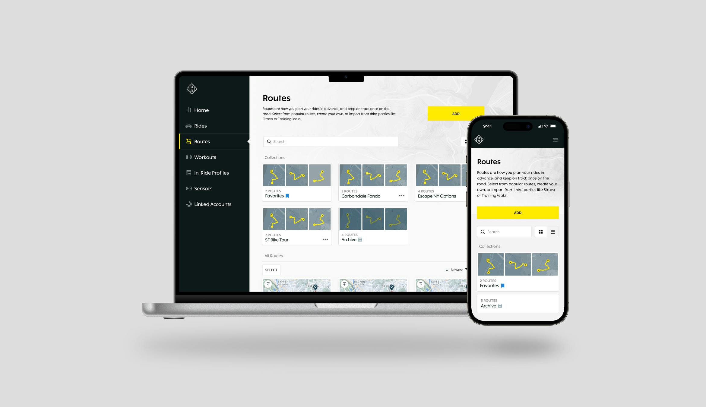
My role in the Dashboard's development was multifaceted, involving the design of its responsive and accessible componentry, integration with third-party services, and the management of intricate user interfaces. One of my key achievements was the design of the route management system, a unique feature in the cycling space that greatly enhances user experience on the Dashboard.


The original user problem that the Route Management system solves for revolves around the complexity and inconvenience cyclists faced in organizing and accessing their routes. Prior to this system, cyclists often struggled with a cluttered and unorganized collection of routes, making it difficult to find and select the appropriate paths for their rides. Especially for avid cyclists with hundreds or even thousands of routes, this lack of organization led to a time-consuming and frustrating experience.
They needed a way to efficiently manage, categorize, and retrieve routes without hassle. The Route Management system addressed these challenges by offering features like route collections, multi-select adjustments, and advanced filtering, which allowed cyclists to easily organize, find, and modify routes. This solution transformed the route planning process into a streamlined, user-friendly experience, significantly enhancing the usability of the Hammerhead Dashboard for cyclists of all levels.
Development Process
The development of the Dashboard followed a user-first approach, with a focus on understanding and integrating cyclist feedback into each design iteration. Using "Jobs to be Done" theory, we pinpointed the right problems at the right times. My involvement ranged from conducting user research and prototype validation to managing design aspects across various browser sizes, ensuring a responsive and user-friendly experience. Through the development of the Dashboard I learned to rely on regular user feedback and develop input to make quality design decisions.
For example, I designed a novel login flow on the Karoo that stemmed from a user-centered approach, heavily leveraging JTBD to identify pain points. Generative research methods, like moderated Zoom calls annotated in Dovetail (our preferred research repository) helped me figure out a common pain hidden in plain sight: Karoo user login. Simply put, the small screen on Karoo made password input difficult. From these insights, I collaborated with devs to come up with a QR-code based login. The user is provided the option to scan a QR on their phone, which opens the dashboard to authenticate the device. This has downstream effects across the Karoo OS, stemming from the benefits of the user’s smartphone browser like keychain management and pre-authentication with cookies. I took these designs back to our research group, and validated the Figma prototypes with Maze and Optimal Workshop. This feature is now the preferred method for logging in over traditional username password input on Karoo.
Our QR login illustrates an important way my approach to product design developed alongside the Dashboard. Early on, I thought of individual design initiatives as touchpoint-specific. My designs would exist solely on a single platform, and not cross over to our other products. This type of thinking wouldn’t allow the QR solution to exist. Over time my thinking process turned insight-first, and the product touchpoint would be secondary. This enabled flows to cross over products where it would improve the experience for riders.
Outcome and Impact
Features like the QR login flow show how the Hammerhead Dashboard improves the Karoo cycling experience. This allows riders to easily connect and manage their data. Along with user management and route planning, the Dashboard is a useful tool for customizing devices and analyzing ride data. With its practical features for adjusting settings and gaining insights into performance, the Dashboard enhances the cyclist's journey, both before and after the ride, making it an essential part of the Karoo ecosystem.


Difficulties and Hard-Learned Lessons
A notable difficulty was the absence of specific metrics or goals in our testing phase, which initially made it challenging to gauge the success of design changes. This experience taught me the importance of establishing clear, quantifiable targets for each project phase, ensuring that our design decisions were not only intuitive but also data-driven. I found it effective to develop quantitative “gates” to achieve before sending off a design to engineering for grooming. It underscored the need for a more structured approach to validating design choices, a lesson that has refined my perspective on product development and user experience.

Reflections
The development of the Hammerhead Dashboard brought with it a wealth of learning experiences. A key takeaway for me was the power of a step-by-step approach to complex design challenges. By dissecting each problem and addressing it individually, I was able to craft more meaningful and user-friendly solutions. This project also enhanced my skills in responsive web design, balancing functionality and accessibility across various devices. It underscored the importance of aligning user requirements with technical feasibility, a balancing act that has become a cornerstone of my design philosophy.
Collaborators
Steve Winchell mentored me as Hammerhead's Lead Product Designer
Will Tribble PM
Grayson Pollock PM