Creating a Tour de France Winning Data Visualization
CLIMBER is a feature of the Karoo series of cycling computers that visualizes the upcoming climbs a rider faces during a bike ride. CLIMBER was initially designed for the competition needs of the professional cycling team Israel Start-up Nation. We adapted their designs into a unique feature set for everyday cyclists. Since then, CLIMBER has been on the handlebars of several Tour de France stage wins. Follow-up user insights earned my name on a patent with our predictive path technology.
Team Israel Start-Up Nation Calls
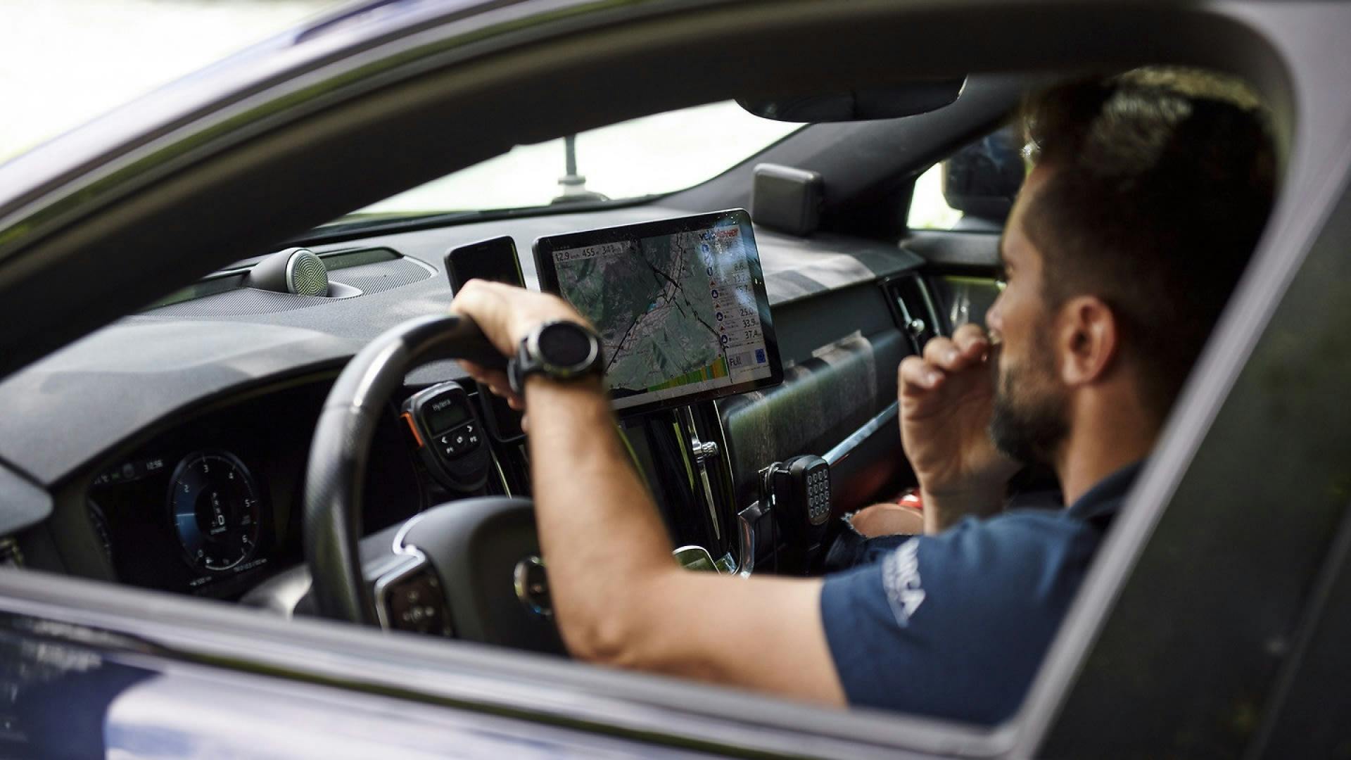
In the run-up to the 2021 Tour de France, Hammerhead gained its first professional cycling team partnership with the UCI World Tour team Israel Start-Up Nation. This partnership allowed my co-designer Steve Winchell and I to perform user research directly with professionals. Fortunately, ISN had several athletes at the time who loved giving product feedback for their competition tools. Tour de France winner Chris Froome, Mike Woods, Guy Niv, and Simon Clarke have each sat down to help us understand their needs. There were two reasons for Steve and I to talk with the team at the time– 1. Hammerhead had a business interest in keeping these pros happy with their Karoos. Since the devices would travel the world and gain media coverage, it’s critical that they genuinely support the product. Just as important, though, was reason 2. The professionals offered us a look into extreme user behaviors. While the pro’s use cases might not represent our median users’ behaviors, their outlier experiences might lead to insights applying to everyone.
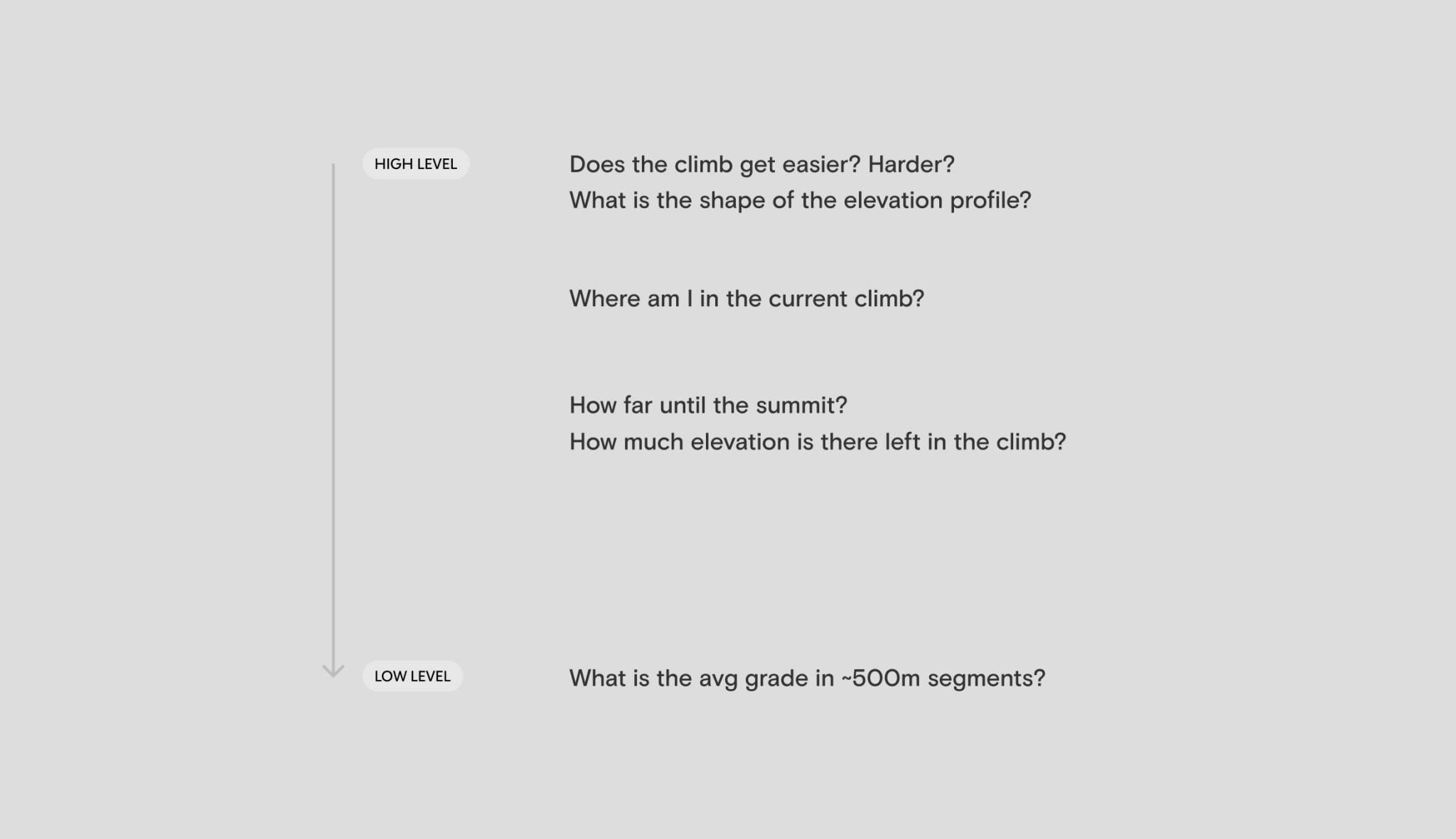
The team brought up a recurring point in our first set of calls: climbing specialists needed better ways to understand the climbs during a race. Mike Woods, the most notable climber on the team, made it clear to us how the data he sees mid-race helps him develop tactics on the fly. In stage bike racing, an on-the-fly strategy is vital. In conversation, we asked why and dug deeper into the exact needs. We already had built a data visualization for a route’s upcoming elevation profile on the device, so where was it falling short? A few things became clear through the conversations and analysis of the calls. The challenge was that pros were looking to get a sense of high-level climb information across an entire stage while also understanding low-level details about what was in front of them. The 30,000ft view was just as important as the 1000ft view. Particular insights helped me come to this conclusion, as the riders ask questions in races like:
- How many climbs are left on this route?
- Is there more climbing to come, or is the worst behind me?
- Does this climb get easier? Harder?
- Are there any places in this climb where I could make a move?
- How far until this summit?
- How many feet are left in this climb?
- How much longer until this steep section eases up?"
- What is the gradient (steepness) for the next ~500m?
I immediately noticed how these strategy-driven questions cover the big picture and the granular. If the riders had the screen of a desktop and Excel in front of them mid-race, this problem would be easy to solve. My challenge became fitting climb details and overviews onto our 3.2” display.
Design Exploration
I began my design exploration exercise by referencing tools the team had already been using elsewhere. While the ISN racers are on the bike, they have race directors in cars relaying information via radio earpieces. The directors ride with screens full of data in front of them. One tool in particular, VeloViewer, is widely used in climb stages. VeloViewer is a platform that specializes in data visualization for cycling routes. The visualizations are detailed and complex and require specialized knowledge to understand. There are some critical visualizations, though, that are intuitive. VeloViewer’s elevation profile colors each segment of a route by grade. We also learned how riders tape route information to their bars in race, and these often include similar visualizations.
Direction A – Updated Fields
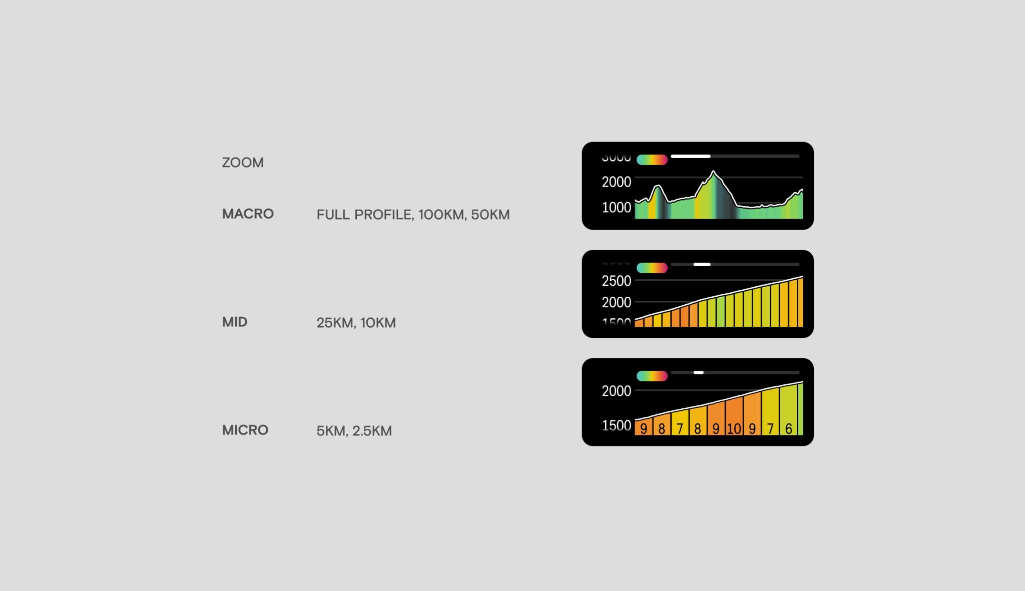
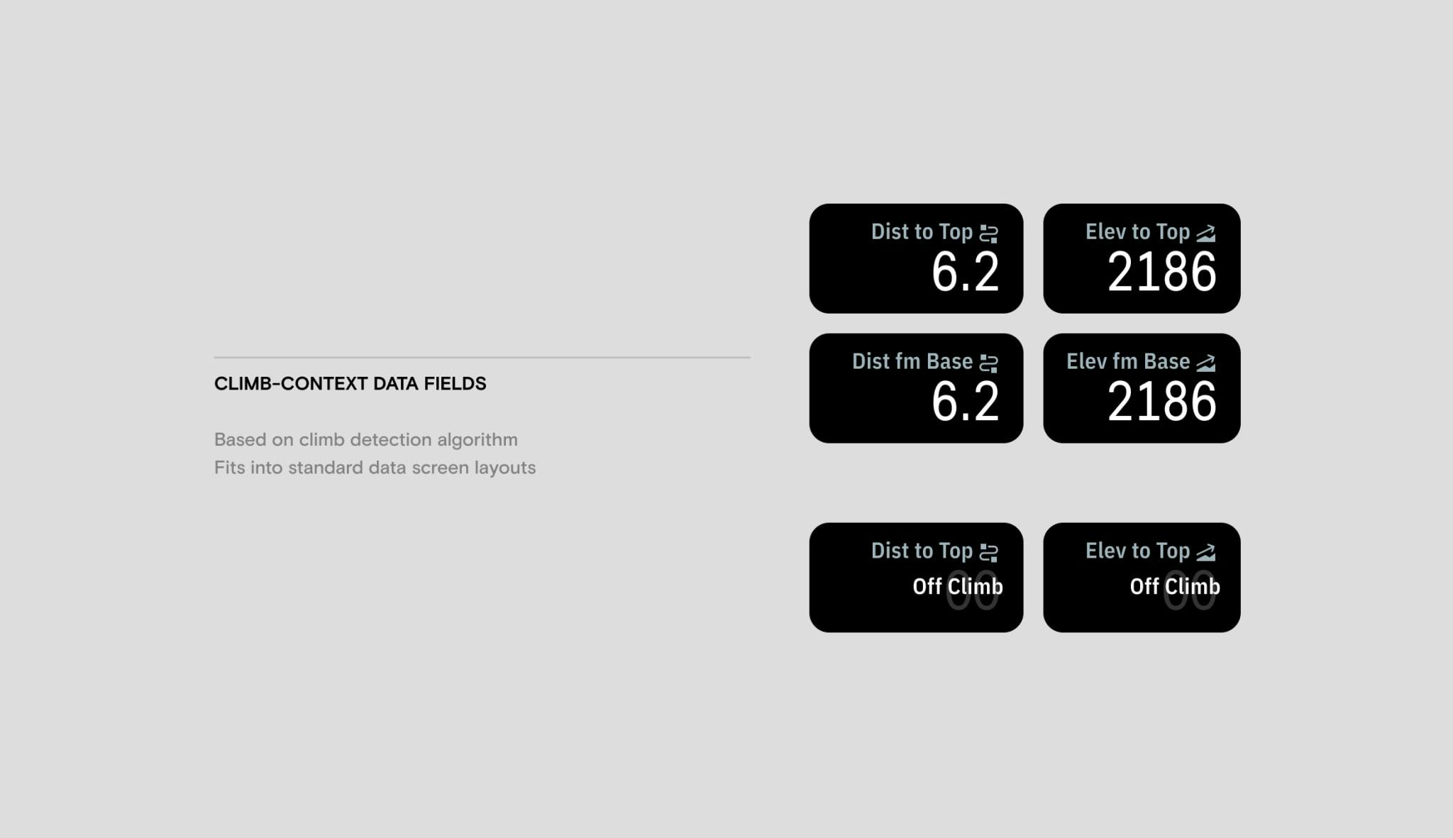
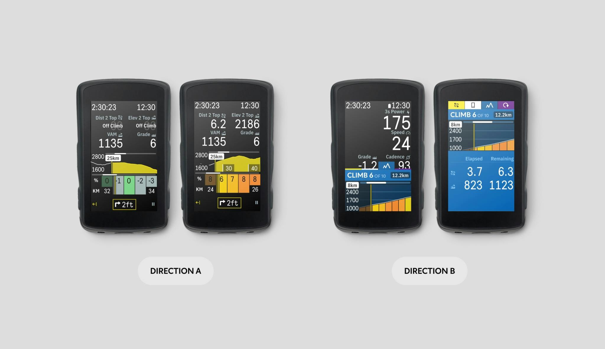
My first design approach leveraged the concept of color-by-grade. The approach included a modified version of our upcoming elevation graph, with multiple levels of detail (LOD) based on the profile’s zoom window. LOD 1 (Macro) was optimized for high-level route overviews. It colored the entirety of the route for easy understanding of subsequent climbs. LOD 2 (Medium) began to break up the 500m segments, as requested by the team, while still being easily legible. LOD 3 (Micro) showed the upcoming 2.5-5km of the route, with each 500m segment labeled by average grade. The rider could zoom through these levels based on needs at the time. To satisfy other needs requested by the team, I added generic data fields to describe climbs. This included distance to the top, elevation to the top, and climbs remaining. Between the upcoming elevation visualization and the fields, riders could build climb-specific pages with all of the information they needed.
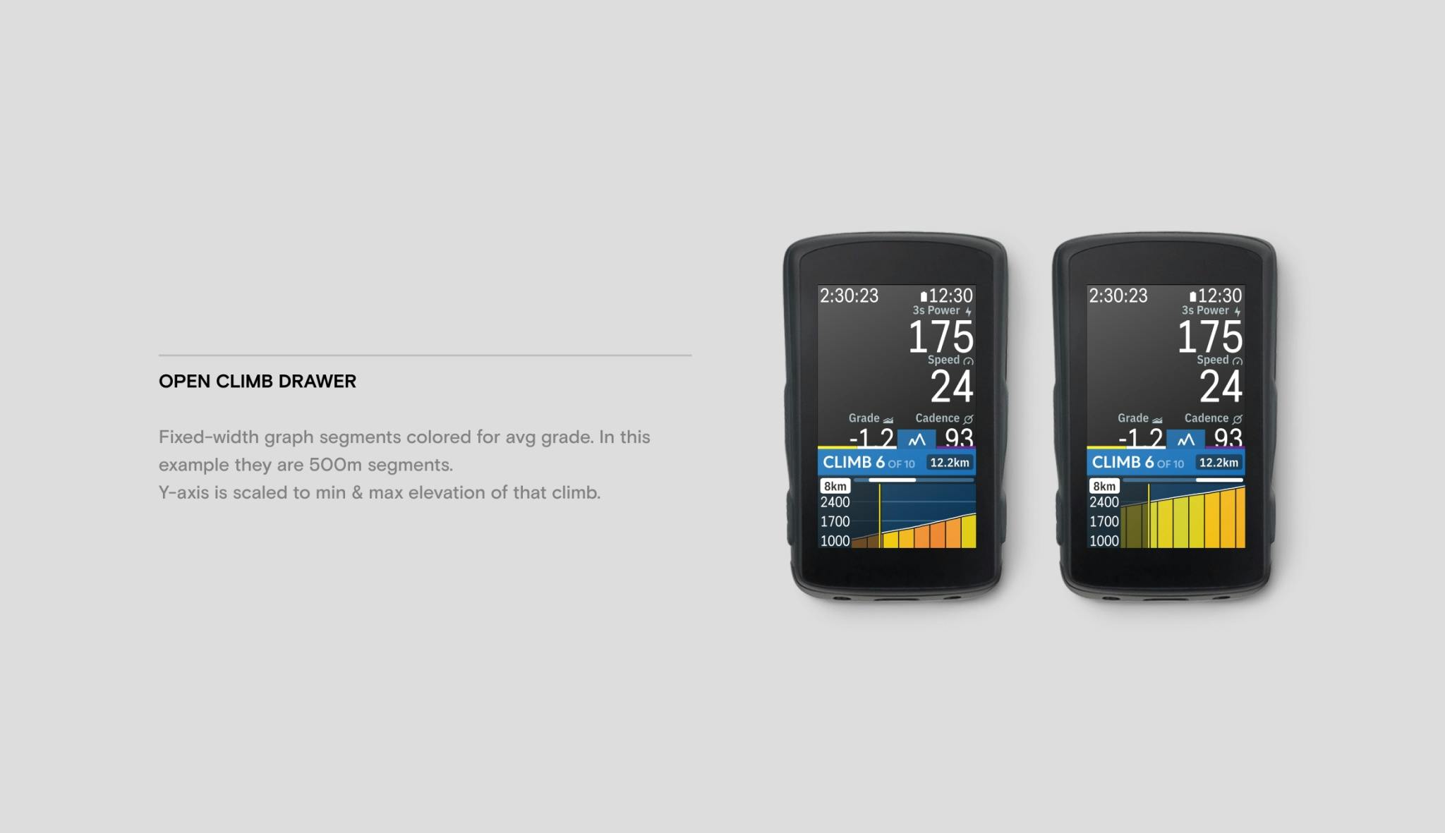
Direction B – Climb Drawer
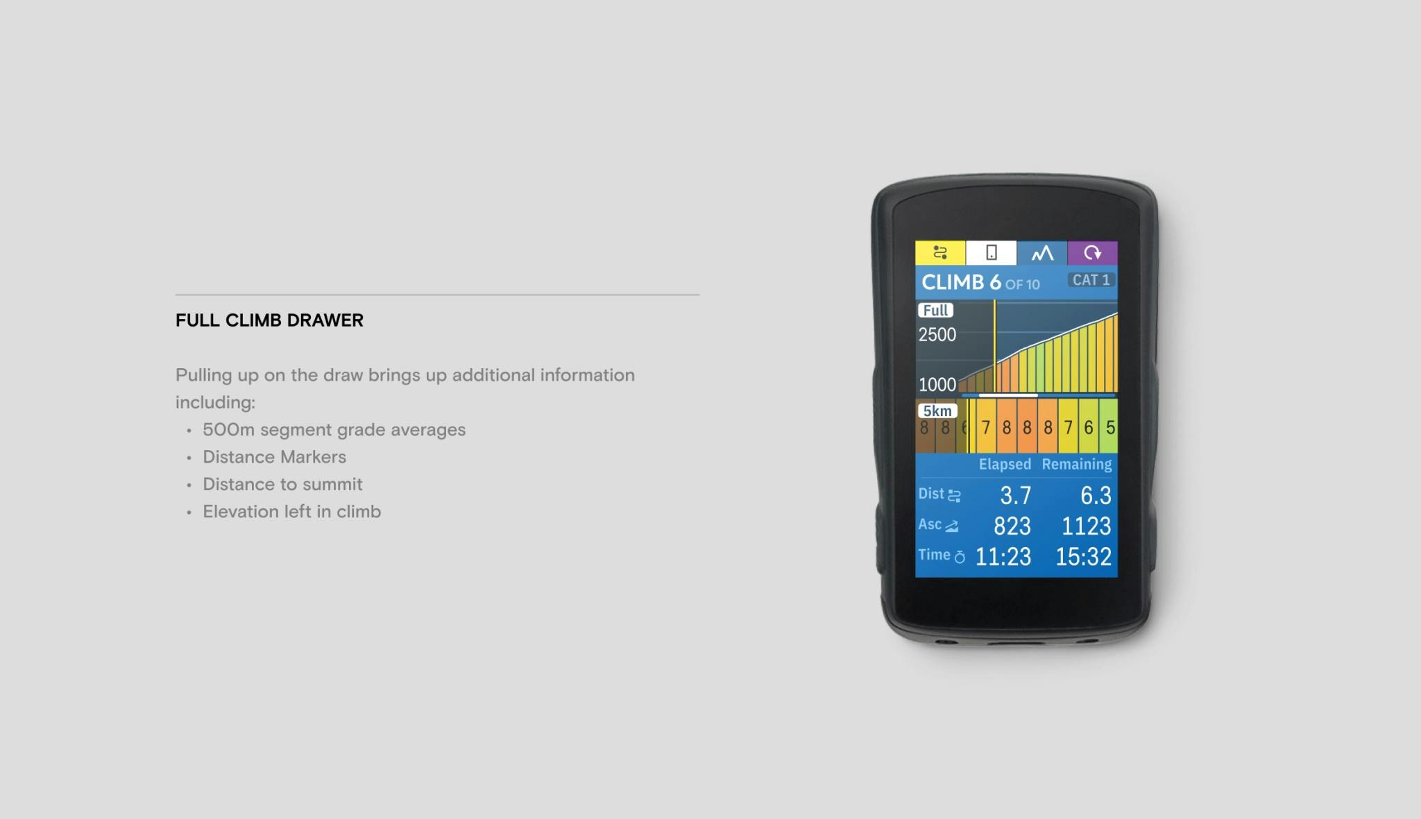
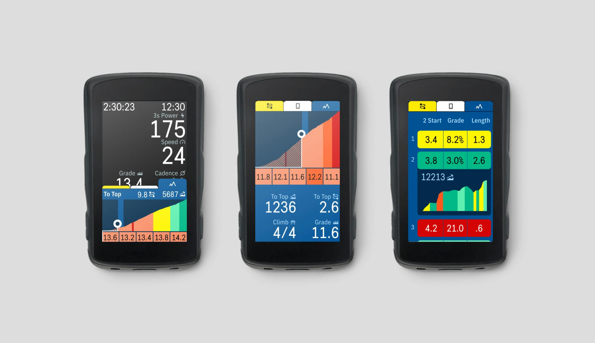
The first direction had downsides, though. Outside of a climb or without a route loaded, a page using the above fields would essentially be empty. For example, distance to top would read “No route added”, as the route was essential to calculate this information at the time. Around this period of the Karoo’s development, Steve introduced a new UI paradigm called the drawer. The drawer was a touchpoint in Karoo’s ride experience that could hold contextually relevant data. It could be hidden if some data field wasn’t applicable during riding. When it was appropriate, it could appear. The climb problem seemed a perfect fit. When no route has been loaded, there will be no empty climb data fields. A climb-specific drawer appears once the user adds a route with climbs. I designed the drawer to satisfy the same LOD needs as Direction A. While in a climb, the drawer would show the remaining elevation profile of that climb with corresponding grade coloration. It would also include the remaining climb data fields, as described above.
Much of the interactivity for moving through visualization windows came down to prototyping. Since the Karoo is limited by its 3.2" touchscreen, any touch-enabled interaction had to feel intuitive and work on bumpy roads. Play with some of the prototypes below:
Engineering Constraints & Refinement
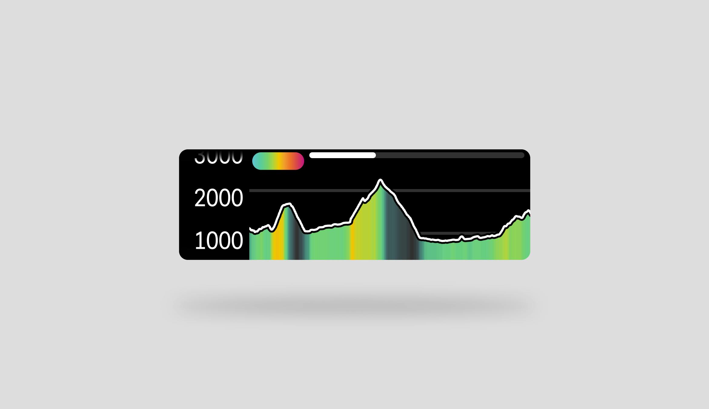
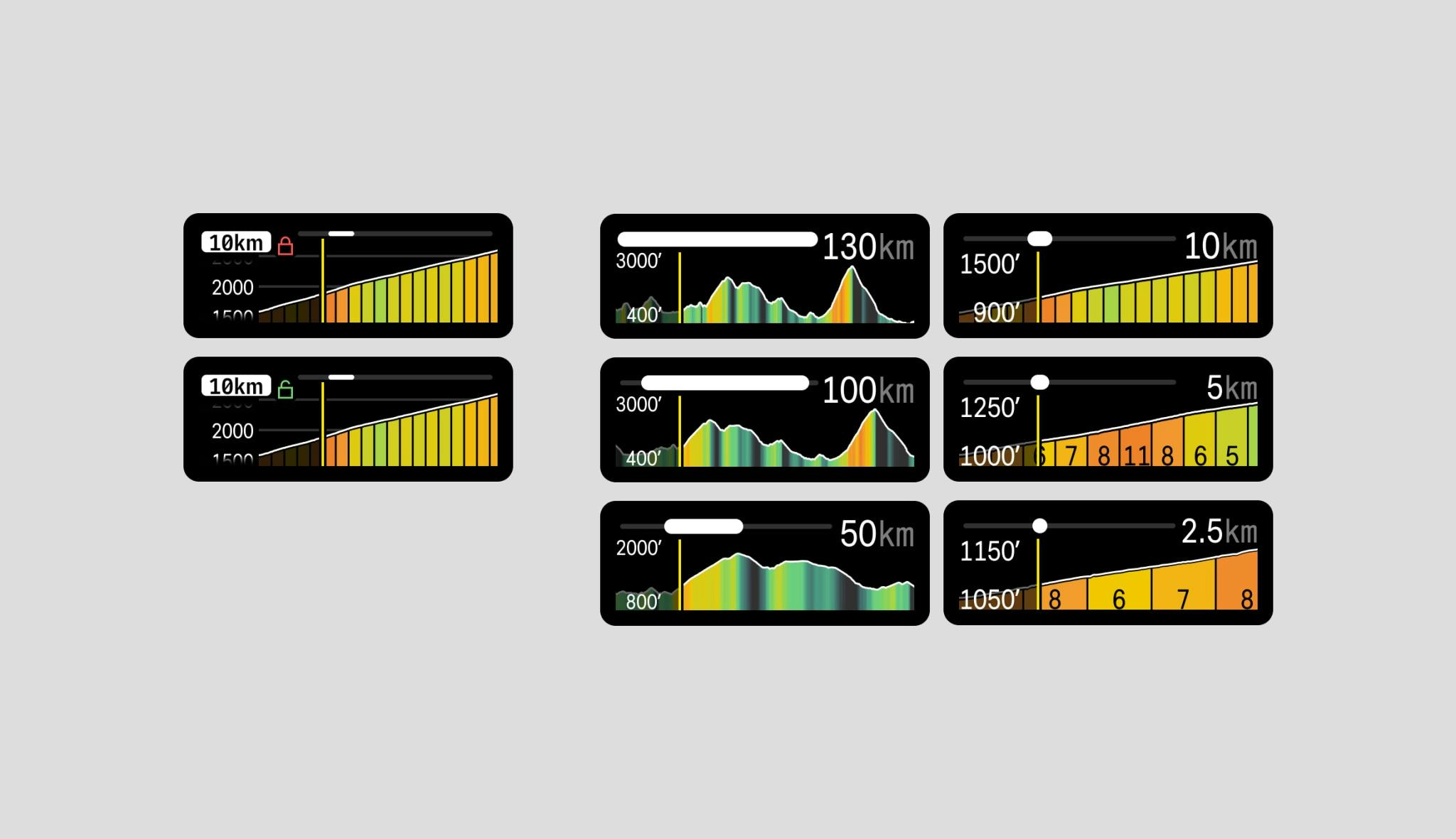
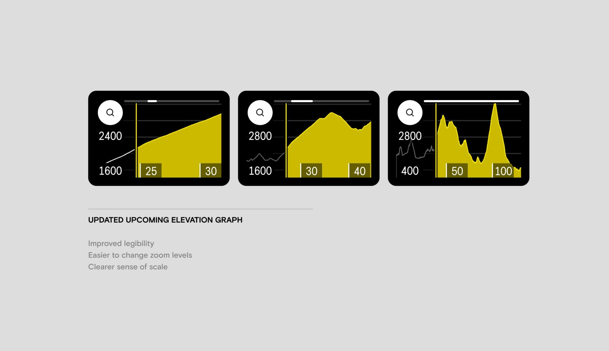
Engineering constraints primarily drove the directions we chose at the time. While the updated elevation chart in both directions proved helpful, combining the coloration with interactivity was established to be unrealistic with our charting libraries (We had been using SciChart). So, I split the single field into two, which would satisfy the pro’s needs together. The first was a revision of the elevation chart focusing on legibility and interactivity. It had a more straightforward method of cycling through zoom levels since we found pinch-zooming wasn’t a good experience on our small display. Its labels also provided a clearer sense of scale. The second was a new field I dubbed the gradient segment chart. The gradient segment chart displays the upcoming 2.5km of a route into 500m segments. These segments are then colored by grade and have been labeled. This chart was pan-able left and right through the entire route. When off-positioned, there was an easy button to snap the view back to the rider’s active position.
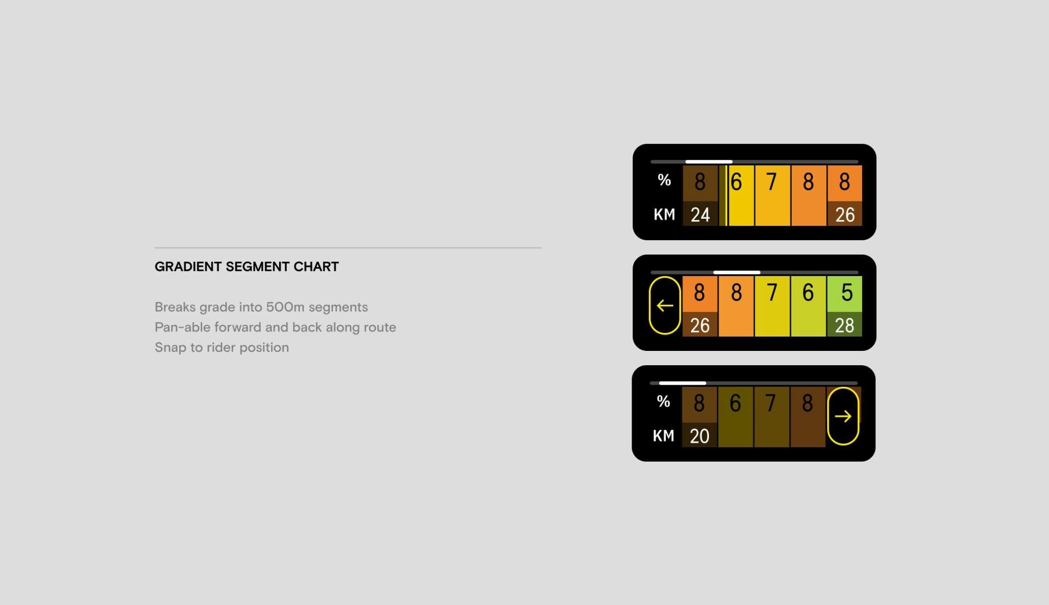
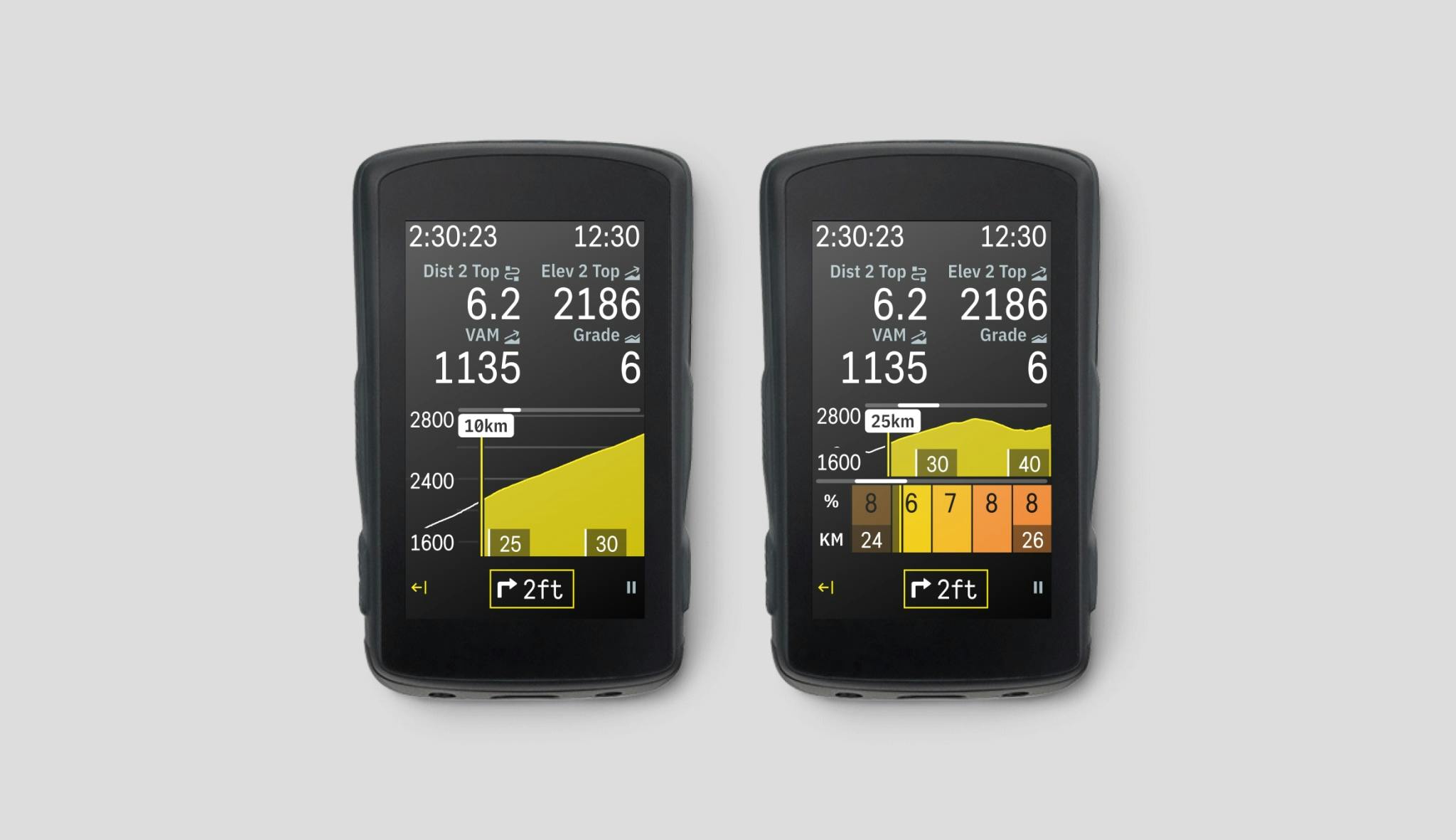
Since Direction B was a new component, rather than adapting existing fields, the developers were open to writing the visualizations from scratch (not SciChart). However, our developers still had hesitations about combining profile coloration along with labels. So, I applied the above changes to the drawer. The single elevation visualization was split into two: An elevation profile colored by grade and a modified gradient segment chart. I adapted their form to exist next to each other so riders could simultaneously ingest high-level and low-level details. Several additional adjustments to this view help make implementation more accessible, like capping the y-axis range to each climb’s minimum and maximum elevation values.
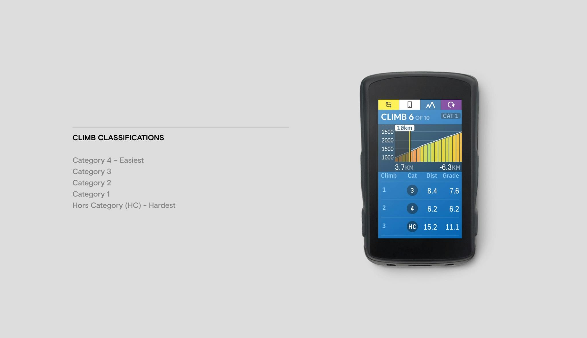
I took both approaches with prototypes back to the team athletes for input. Each direction proved helpful, but the high-level stage synopsis wasn’t satisfactory. To compensate, Steve and I looked at the drawer when outside of a climb. The real estate was largely unused, and we found this is when riders might be asking questions about upcoming climbs. So, we used the out-of-climb state to show a table of upcoming climbs along the route. Rather than providing a single elevation, our climb detection algorithm was used to list the climbs and their associated stats one by one. A roadblock I ran into was conveying a climb’s difficulty. If I summarized a climb by distance alone, a long climb might not be challenging. Just gradual. If judged by grade alone, a climb might be conveyed as difficult. In reality, that climb could be brief. I looked to the original information riders tape on their bars to see how they mark climbs. I found there is often a marking on climbs known as their classification. Classification accounts for grade, distance, and other factors to help convey relative difficulty. The Union Cycliste Internationale (UCI) rates significant climbs in stage races by the following classifications:
- Category 4 - Easiest
- Category 3
- Category 2
- Category 1
- Hors Category (HC) - Hardest
While these classifications are subjective, varying from race to race, Strava has publicized its classification for its segment feature. Since Strava’s segment climb ratings are widely used, I found this to be the gold standard to reference. On each upcoming climb, I added a climb classification. The classifications of the upcoming climbs help fill the high-level view when used with the rest of the climb drawer. Together, the design refinements were released in 2021 under the feature name “CLIMBER.”
Predictive Path Technology
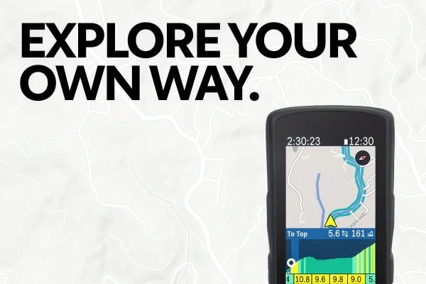
Later design and research initiatives at Hammerhead led our product team to learn from an insight evident in hindsight: Cyclists riding their usual routes don’t usually load those route files before their rides. They find no need to do so because they are familiar with the area. Without a route, riders feel encouraged to explore and intentionally go off-route. The impact of this behavior is that riders miss out on route-based features. Since CLIMBER depended on a route being pre-loaded onto the device, the feature fell victim to this behavior. The magic of CLIMBER didn’t work without a route. So, we began tinkering alongside our mapping and nav engineers to see if it was feasible to do some route prediction. While we didn’t think our device could magically understand a rider’s route at any given point, there can be contexts in which we have a good view of the upcoming few miles. For example, if a rider is on a major road with no significant turn-offs for five miles, we can say with fair confidence that they will stay on that road for at least five miles. While this cannot always be correct, it will most likely be right. We adapted this rationale into a set of rules and behaviors to try and understand where a rider is going, even without a route.
We could run the same climb calculations with a confidently predicted route segment. Since predictive path technology meant CLIMBER required little to no configuration, CLIMBER’s feature adoption went through the roof. The simple insight that riders don’t load routes in their usual stomping grounds was vital to transforming CLIMBER from a specialty racing feature into a generally valuable tool for everyone. We’ve since applied the predictive path to other aspects of the in-ride Karoo experience. We have since published the principles behind our predictive path technology as a provisional patent. You can read our application here.
Feature Reception
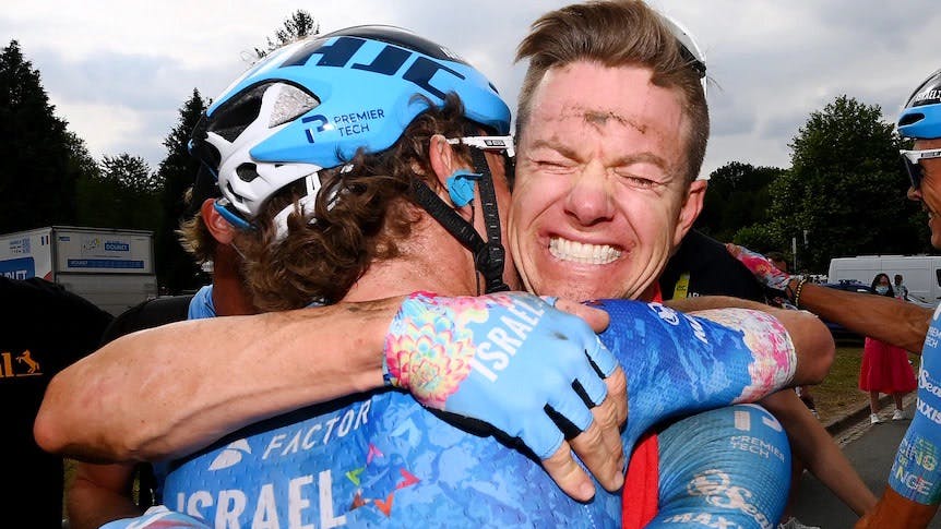
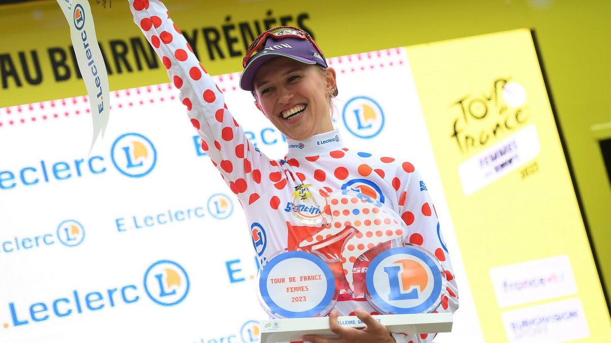
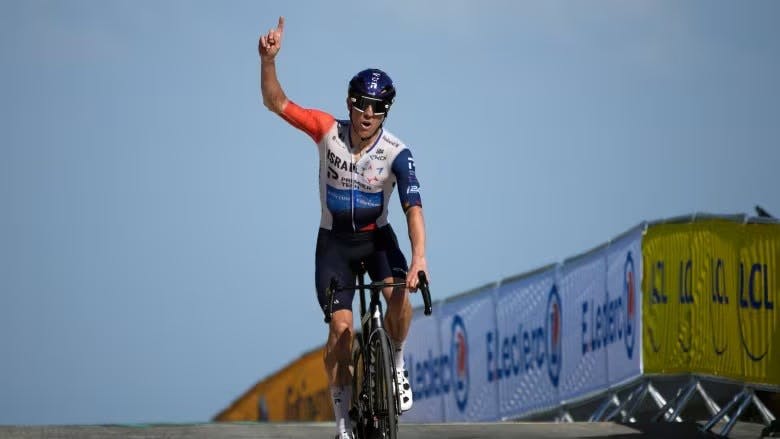
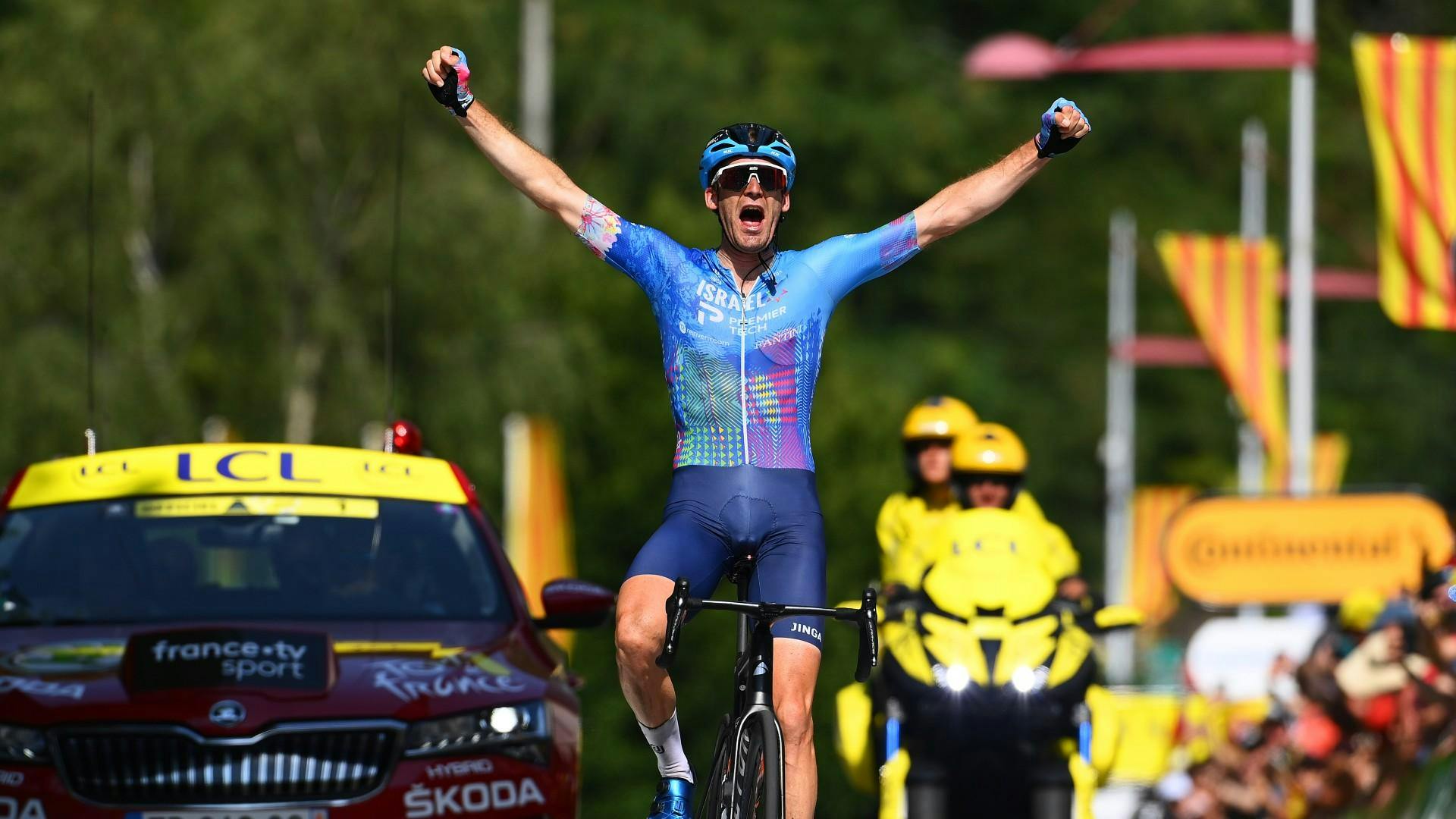
Soon after releasing CLIMBER, Mike Woods held the Tour de France climber jersey until stage 14 of the 21-stage race. Team Israel Start-Up Nation has since won three stages of the Tour de France using the Karoo 2 and CLIMBER (2022 Stage 5 Simon Clarke, 2022 Stage 16 Hugo Houle, 2023 Stage 9 Mike Woods). CLIMBER has also helped our Team Canyon-SRAM athlete Katarzyna Niewiadoma win the 2023 Tour de France Femmes climber jersey. While I can’t take credit for these professionals’ wins, the Karoo and its CLIMBER features have been on the handlebars during each performance, helping the riders make strategic decisions.
The public release of CLIMBER and Predictive Path Technology was highly regarded as one of the standout features of the Karoo. The introduction of the feature increased CLIMBER’s adoption from being active on fewer than 20% of rides to over 80% of riders having used it. Here is a quote from DCRainmaker, a prominent sports tech writer, that sums up the features well:
Of course, the fact that Hammerhead rolled out another new feature shouldn’t really surprise us. With their bi-weekly firmware update cycle, it’s a constant spree of new updates. And I can only assume (or at least hope) that with the recent SRAM acquisition, that continues or even accelerates. While many of their updates have been more feature catch-up type additions, this one is truly new – with nobody in the marketplace having this.
Collaborators
Steve Winchell Co-designed CLIMBER and helped conduct our feature-critical research.
Dave Nesbitt Led the engineering implementation of Predictive Path Technology, our CLIMBER algorithm, and solved complex technological constraints. Dave’s a navigation magician.