A Playstation Controller Helped Me Rain-Proof a Touchscreen
Control Center is a system-wide Karoo OS experience first released in 2021. It allows cyclists to trigger ride-critical functions, like changing workouts or routing models. All while maintaining accessibility in the real world and on the bike. How did a PlayStation 4 controller help design it to be rain, sweat, and mud proof?

The early operating system we had designed for the Karoo cycling GPS proposed a simple in-ride experience without much concern for future feature growth. While there was a place for every in-ride action a rider might want to perform on the device, that subset of in-ride actions was limited. We supported only a handful of device controls at the time. This included pausing rides, ending rides, changing routes, and navigating to POIs, like the rider’s starting location. Soon after release, early Karoo adopters began to pile in feedback on the features critical to their use cases. We discovered flows needing attention, from professionals calibrating their advanced sensors to weekend warriors changing their screen brightness. To account for the increasing number of in-ride features, we had to rethink fundamental in-ride design patterns for consistency and ease of use.
Discovering the problem
Not long into our roadmap, we realized an underlying problem– without well-defined UX patterns within our OS to house these in-ride controls, features were inconsistently crammed into various locations. To paint you a picture of flow inconsistencies– it might take a long press to drop a pin on the map, drag down to refresh the connected sensors, and squeezing the hardware buttons to make the screen sleep. With each new flow requiring in-ride controls, we had to invent new places to house buttons, gestures, and inputs. It didn’t initially present itself as a problem, but the holistic experience became cognitively challenging. The new user education grew to the point where riders regularly searched our support pages for the same questions.
So, we recognized that we had to improve consistency to make a more maintainable, intuitive experience. We had to understand the suite of problems and actions users had to go about from when they loaded their ride to when they pressed “end.” To set about this initiative to improve in-ride actions, I concocted a plan inspired by principles of design thinking–
Stage 1- Initial generative user research & synthesis
Stage 2- Design exploration
Stage 3- Validation research to converge on solutions
Stage 4- Design refinements
Initial Research
At this point in my Hammerhead experience, I had built a recurring list of riders who had opted into research sessions. This group consisted of a few hundred people representing all types of riding from various backgrounds. Working on a product that attracted loyal and loud users was a great fortune. Riders would come out of the woodwork begging for their input to show up in the next software update. My email list started to feel like a little club with friends worldwide. These are friends who I’ve only talked with via Zoom. I still stay up to date with some of these riders today, like Chris, a pro cyclist from Colorado Springs, and Deborah, a retiree who surprises me each call by showing her latest road bike epic. I dubbed us the “Hammerhead Research Group,” although in reality, it all operated through the Mail client of my Mac. Whenever I sent out my Calendly link to schedule a time to talk, my entire week filled within the day.

With initial calls exploring new problem spaces, I’ll start with a sheet of notes on topics I’ve loosely read on forums and other feedback sources. In this case, I covered a broad spectrum of scenarios I’ve read about. If I were to ask a rider, “What actions do you perform in any given ride?” the feedback would be stale, unoriginal, and unlikely to reflect specific scenarios they’ve experienced in the real world. Sure, some feedback might be helpful, but from their desk, staring at their screen, it can be challenging for users to visualize their device experiences. So, along with the topics I hope to weave into the conversation naturally, I have a few one-liners to inspire rich conversation. In the case of this project, they include:
- “When was the last time your ride went terribly wrong?”
- “Have you ever given up using the device mid-ride?”
- “What’s the first thing you do after loading a new ride ride?”
- “Has there been a time when you have modified your ride plan mid-ride?”
- “Where might you be finishing a ride?”
Granted, these alone aren’t going to paint a picture of the most essential problems most riders face; the outlier experiences often give insight into issues common to all users. In the case of this in-ride actions initiative, I tried to touch on topics like routing, ride stoppages (think coffee breaks), wireless sensor troubleshooting, and more. Any conversation wouldn’t cover every subject on my list, but over 10-20 calls, there would be a larger sample size covering most topics. I’ve also found that absorbing new ideas might emerge early in a research sprint. It can be good to work on these new topics in future research sessions later in that sprint. A great example in this project was how we uncovered the need for a “Route-Reverse” function, allowing riders to retrace their path using turn-by-turn navigation, accounting for the opposite direction’s routing hazards (think one-way streets). I won’t dwell on Route-Reverse for this case study, but our software now has several features to support this user journey.
One particular feature that I've grown to adore, available for quite some time now, is the option to ride a route in reverse. It's become a favorite of mine, as it gives the sensation of exploring an entirely new route. – Veerle Pieters
I had several hours’ worth of customer calls at the end of this research sprint. Using Dovetail, our research analysis tool of choice, I went through annotating call scripts with relevant tags. After sifting through tags, I took note of trends common across calls. On Dovetail, I write these as draft insights. Only once I find enough supporting evidence do I turn a drafted insight into a published insight, ready to share with team members and other project stakeholders, like engineers. While several insights emerged from this initiative, a few stood out.
For one, many riders find themselves riding in rainy conditions or getting sweat on the screen, reducing the capacitive touchscreen’s usefulness. We were aware of this, but surprisingly, we heard that riders in colder climates faced a similar problem using gloves. Similarly, gravel riders sometimes found the touchscreen unusable when their routes were overly rough. Among these more extreme use cases, a theme emerged that the touchscreen alone wasn’t a satisfactory solution for performing in-ride actions. While in good conditions, the touchscreen is the preferred method of device interaction, it couldn’t be the only way to go about tasks. The supporting outlier use cases may not have justified a design solution if looked at independently. However, together, they paint a picture of a shared problem that is impactful to solve.

The insights generated from our research exercise led us to develop a few foundational principles to guide the redesign of our in-ride experience:
- Any action that the rider might take during a ride must be accessible without the use of the touchscreen
- Inputs on the touchscreen must have high legibility and large touch targets
- In-ride actions must be accessible from any given in-ride screen state with a minimal amount of steps
- In-ride actions should exist in a single location to reinforce a consistent mental model
With these requirements, we were ready to explore solutions.
Design Exploration
Diving into possible interaction patterns, I wanted to see how other hardware products were going about this problem. Our device’s form factor and usage fit somewhere between the that found on smartphones, smart watches, and car head units. Most of these products had a clear, shared control structure: each platform provided a central place where everyday and device-critical actions could occur. This is often a quick-access page on car head units with light controls, nav controls, and climate controls. For watches, there are menus readily accessible with connectivity, notification, and battery controls. On smartphones, there are pages one gesture a way to perform similar actions. In our research, we heard users referencing the control center found on iOS, so it was a natural pattern to reference. While we used the same vocabulary, I designed the control center on Karoo OS for riding, where situational awareness is critical.

We decided to use a similar model of hiding a page above the screen, which could appear with a single pull-down gesture. When asking users how they expect to find controls, this was a natural response, as their smartphones have established this mental model. To begin figuring out which controls belonged where on this page, I first compiled a list of all possible in-ride actions based on the feedback I heard. At this point, I could make educated guesses on item priority, so I designed it to validate these choices later on. Items like brightness controls, loading routes, and quickly navigating home were likely more critical than calibrating sensors and saving POIs on the fly. We weren’t sure if some of these controls were even needed. So, I anticipated, as a part of my validation research, to ask users to rank and self-categorize these items based on their own experiences.
The next major design problem I had to solve was navigating my way around the principle that “Any action that the rider might take during a ride must be accessible without the use of the touchscreen.” How might I adapt the control center model to work via hardware buttons alone? In this era of the Karoo OS, the hardware buttons only performed a single action at a time. For example, the top left button only mimicked a left-swipe gesture while in-ride. There was one exception: the quick actions at the time. There was an established pattern of squeezing the top two hardware buttons to open a menu to turn off the device and sleep the screen. The problem was that this pattern wasn’t adequate for a large pool of possible actions, and there was no way of performing the same actions via touchscreen alone. If users could touch, it had to be used with buttons, and vice-versa. But, the pattern was worth diving into and exploring. I had the instinct to combine the squeeze pattern, already established for power used, and associate the action with pulling down the control center. Step one: done. A way to find the controls from any screen was to swipe down or squeeze the top hardware buttons.
Prototyping
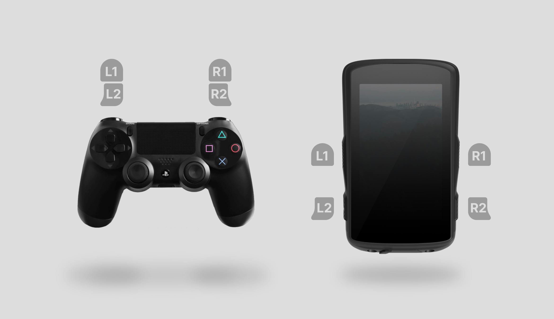
Step two proved to be a more significant challenge: Once the control center was open, how did a rider navigate a non-defined number of actions that had the potential to grow over time? To iterate on designs with a better understanding of the hardware experience, I had to figure out a method to prototype using hardware controls. At the time, we could load Figma prototypes on the Karoo device, but Figma didn't support device hardware buttons. Looking through design inspiration, I found that video games solve similar UX problems with their hardware controllers. Menu diving in video games is an excellent proxy experience to study. Around this time, Figma introduced support for specific game controllers as triggers for prototype actions. I drove to my local Target and picked up a PlayStation controller. Using the buttons and button combos, I designed the control center with hardware button functionality first. For prototyping, I mapped the controller’s L1 to the top left Karoo button, L2 to the bottom left, R1 to the top right, and R2 to the bottom right. I went about trying combos, double presses, and long holds. Soon, I started to narrow in on some approaches.
Control Center Architecture
- My first instinct was to stack all actions by the rank of user priority in a single list and use the top hardware buttons to navigate through them. Via Figma prototyping, this first model failed. There could be more than 20 possible actions on this page. Finding your way to a low-priority action, like dropping a POI, required almost 20 button presses. Not acceptable. My next instinct was to “loop” the selected action. Instead of navigating through 20 to get to POI, the user could navigate in the opposite direction, cycling to the end. While this halved the required button presses to get to any given action, ten steps felt like too many, and we anticipated more.
- My next choice was to collate actions by similarities. The idea was that rather than a single list of 20 actions, there could be four lists of five actions. The user would have to go through two steps– category selection and action selection. There is a tradeoff to this method. Any given action would require at least two actions. But, the benefit is enormous. Any given action would require at most five actions. Upon prototyping this structure, we felt the mental model was easy to grasp. Navigating to a given action felt instinctual within a few uses of these prototypes.
- For due diligence’s sake, I had to ask myself if we would reap further benefits by taking this one step further. Could we have three categories with three sub-categories containing three actions? In theory, this would reduce the maximum number of steps to action to 3 but also increase the minimum number of steps. So, we prototyped. While playing with this, it indeed felt quick, but the initial experience was challenging. I had to think through my steps, and the menu diving added complexity. After practice, though, it was speedy. My worry with this was that it would be too hard to learn. Nobody likes menu diving. This design was ripe to take back to users for design validation.

A more complete rain lock
Redesigning the architecture to hold actions wasn’t a solution to the rain lock problem. Opening the control center required a swipe, which wouldn’t work in the rain. So, since the control center was absorbing the original quick settings actions, we also chose to drink the initial gesture: squeezing the top two hardware buttons. Now, there was a hardware button equivalent to swiping down. I made an assumption early on to create a rain lock action, one of the first actions within the control center. The rationale was that anyone opening the control center via hardware buttons would likely need to turn off the touchscreen due to rain or sweat. The first action at their fingertips would be this UX-critical one, helping them disable their buggy touchscreen quickly. This was important, as troubleshooting the Karoo mid-bike ride could be dangerous. It’s become a rite of passage within Hammerhead to crash your bike while playing with the device. While that might be acceptable within our product team, that’s unacceptable for a consumer product. Riders might interact with our product at high speeds and in dangerous circumstances. Within the context of the in-ride experience, we need to design for situational awareness.


Sensor status
Another insight from my customer calls was how riders were using a workaround to check on their connected devices. One primary Karoo function is connecting with external sensors and devices wirelessly. These sensors include heart rate monitors, wireless shifters, smart lights, and rear radars via Bluetooth LE and the ANT+ protocol. Since our device acts as the hub in a multi-device, multi-protocol network, there is a high degree of complexity. Some sensor vendors don’t build their products with the same connection reliability as others. This problem is shared across all cycling head units– sensor dropouts are standard. What’s unusual, though, is having the head unit convey device status to the end user. More so, no one had been effectively communicating this information mid-ride, where situational awareness is vital. However, we found that power users were exiting the in-ride experience and opening the sensor configuration app to check on this information. When asking about this workaround, these users left the ride app mid-ride to reaffirm that everything was working smoothly.

This wasn’t ideal. When asked about the topic, more casual Karoo users stated how, after thinking about it, they would want to see the sensor status. Diving into why, the typical answers were:
- To verify that the device is appropriately recording their data and
- To confirm that each device had sufficient battery for their ride
Power users only knew to open the sensors app because of their deep knowledge of the device. They had to know the secret hardware long-press to extend Android’s app switcher to get to the sensor app. They then had to navigate to each sensor, one at a time, to confirm connectivity and battery status. So, I went about making this flow easier. First, I gave connected sensors their category within the control center. From here, I went about iterating on designs to convey battery and connection status in a highly-legible way. After a series of design reviews, we focused on icon-based device symbols with associated status iconography and animation. Shape, color, and animation meant the sensor list could be read in low-visibility conditions, like sun glare.


Design Validation
Once our team felt the design concepts offered complete solutions to the above insights, I went about validating them. In the first round of validation, my concerns were with hardware button approaches, control center action priority, and the ability to succinctly convey sensor information. With a series of questions to answer, I built five prototypes that might prompt feedback. I created two versions of each prototype for hardware button controls: 1. A PlayStation controller-compatible set and 2. A set used the Q, E, A, and D keys to mimic the UL, UR, LL, and LR Karoo hardware buttons. The controller prototypes were ideal for in-person testing and sharing with coworkers. This got us closer to the on-device experience. The keyboard prototypes were perfect for embedding within a Maze test so our research group could asynchronously and remotely try my design solutions. To accompany the prototypes, I had written a set of missions to ask the participants to follow. One mission, for example, was for the user to “Pretend you are riding with gloves on. The sun comes out, so it’s hard to see the screen. Raise the screen brightness.” Dropping them into questions like this requires more context, so context screens precede it. Maze provides built-in tooling to track mission success rates for a Figma prototype and record click-heat maps.

These tools help find UI and certain UX problems, allowing us to nip them before development. Like many research strategies, success rates, and heat maps alone don’t paint a complete picture. Alongside the user missions, I make sure to include follow-up questions, rankings, and other question types to fill in knowledge gaps. Regardless of survey type, I try to include open-response questions as they allow us to uncover problems we may have missed in our initial research. I also deploy a strategy of including specific opinion scale questions, which could be repeated in future validation surveys to verify designs are moving in the right direction. These questions can act as micro KPIs within the context of a research initiative to quantify improvement. With a diverse set of questions exploring the weaknesses of my designs, I sent out the survey to my research group.
Design Refinement
As the responses trickled in, I began to pick up on a few patterns:
Post-Action Confirmation
After triggering in-ride actions, users analyzed the screen for several seconds to confirm they successfully initiated their action. For more complex actions, there had to be follow-up UI changes to represent the state. These state changes could be hard to recognize in low visibility or glances. To solve this, I built confirmation screens that would immediately appear for several seconds post-action. Each screen would use the same action iconography I designed, but larger. It would also have accompanying text set in large, clear type. Doing this made it apparent that an action had been taken, and there was no need to spend precious seconds studying the screen with their eyes off the road.

Post-Action Return-to-ride
After triggering in-ride actions, users had to escape the control center to return to their ride. For the vast majority of use cases, we found that users weren’t performing subsequence actions in the control center. If they visited the control center, it was no longer for a specific purpose. So, why were we keeping them in the control center once they initiated their desired action? The flow was getting in their way since they needed to escape the control center, which could take up to two additional steps. Each extra step impairs the users’ situational awareness. To fix this, I found that we could close the control center immediately upon action.
Rain Lock? Mental Block.
Screen lock as a high-priority action was well-liked, but once the touchscreen was disabled, some found themselves stuck in the control center. Since the lock action was nested within a category meant to escape, the user would have to hit back (The lower left button) twice. Users new to the control center experience needed clarification and guidance on escaping. My redesign was three-fold:
- Besides pressing back to escape, the same squeeze interaction used to open the control center was also used to close it. Squeezing the buttons acted as a control center toggle, regardless of state.
- In addition to the select and enter buttons used to navigate into the control center, I visually added a back button to educate control-center escape.
- If the rain lock was enabled and the control center was open, it would open with the rain lock toggle selected. This acted as a safety net in case someone was lost with the touchscreen deactivated. I highlighted the very button to unlock the touchscreen, reinforcing the escape mechanism.
These three improvements helped make the rain-lock interface effective for those who needed it, easy to learn for those new to the device, and safe for those who found their way to it by accident.
Specialty Sensor-Actions
Data-focused riders mentioned checking their power meter sensors for battery and connectivity and calibrating them before each ride. This repetitive action was another reason for the sensors app menu diving. I took this behavior as a justification for a pattern to control sensors with supported actions. To do so, I designed a place on the sensors page of the control center to allow for a single dedicated sensor function if available. This pattern eventually grew to a new design paradigm for the control center: Single-action sensors could live on the sensor page, and multi-action sensors could have their specialty control center page. The second part of the principle meant that highly functional devices, like smart lights, could gain richer controls. At the same time, read-only devices, like heart rate monitors, didn’t occupy much space.

Impact & Conclusion
After building out the above design changes, I sent back a streamlined survey to confirm the changes moved designs in the right direction. Along with improved mission success rates, the standardized opinion scale questions suggested that my changes improved usability. I subsequently cleaned up the designs for developer handoff. Regular engineering collaboration helped us find dev constraints and design our way around them early. Hammerhead released the control center publicly in 2021. Since then, we’ve iterated and added onto the control center where it seemed fit. The established design principles have allowed the control center to grow and adapt as our feature set has advanced.

I absolutely love the new ‘Control Center’. What a fun and intuitive way of interacting with the unit! -Sven
The control center as a whole is an insanely huge improvement over the UI from around the Karoo 2 launch -PM_ME_SQUANCH on Reddit
Perfect for cyclocross when the poop, sweat, goop, mud, rain, and blood could all pause! -@ryaniprice on Instagram
Since then, we’ve redesigned our new user onboarding. I included an optional but encouraged walkthrough of the control center, as it’s a critical component of the Karoo OS. The walkthrough effectively educates how to use the control center with touch and hardware buttons within a minute. We’ve also incorporated a notification page to the control center that effectively handles all Android system notifications in a hardware-friendly format. The control center project was one of the first significant initiatives I led, covering the gamut of processes we designed for Hammerhead’s product team. The learnings through this project inspired further improvements to our process and showed me how a design initiative can efficiently progress from end to end.
Project Collaborators
Will Tribble took on the PM role for this project
Steve Winchell mentored me as Hammerhead's lead designer at the time